I love facilitation techniques that are “high density” — that is, they pack a lot of meaning into a single exercise.
I have written previously about how the common technique of “dotmocracy” can be improved upon. I stand by those observations and wanted to show you a very recent example of why. It also provides greater detail to support a recent post about deciding how to decide before deciding.
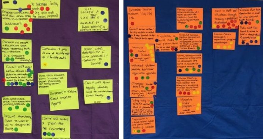
If you were to look at the photos below, you might interpret the dots on the ideas in various ways. Perhaps you’d notice that there are more dots on the orange papers than on the yellow ones. You could therefore reasonably conclude that the orange ideas were more popular with participants than the yellow ones, and therefore worthy of greater attention. And that would be [partly] true.

But let’s look more closely at the dots themselves. Do you notice a pattern in the colours? What if I told you that green dots represent ideas that are likely to show a high return on investment and blue dots represent ideas that are impactful? Red dots are for ideas that are achievable and yellow dots are ideas that can be sustained over the long term. How might your interpretation of this data change with that new information?
Now you might notice that some ideas on the yellow paper (middle left of the purple sticky wall above) are deemed high impact and high ROI, but lower in terms of sustainability or achievability. (It is always important to notice what participants do not say, alongside what they do. A lack of dots matters!) Others are highly achievable (top left), but low in terms of likely results.
You would then be able to take your analysis of this feedback to an even deeper level. What is it about these ideas that makes them important but not easily doable, and what conclusions might the group want to draw about that?
I hope that it’s obvious here how adding meaning to the colours of the dots allows you not only to see which ideas generate a lot of buzz (i.e. lots of dots), but also to understand an additional layer: which ideas meet a number of important criteria (i.e. all colours of dots) and which ones are critical in some ways but fall down in others (i.e. dots of particular colours and none of the others). This more nuanced understanding is likely to lead to different next steps, or at least different follow-up questions.
That’s a high-density collaborative technique. Stay tuned for a few more in the weeks to come. They’re great to have in your toolbox as you seek to help groups make wiser decisions faster.
